Gazprom Neft. Industrial Safety identity
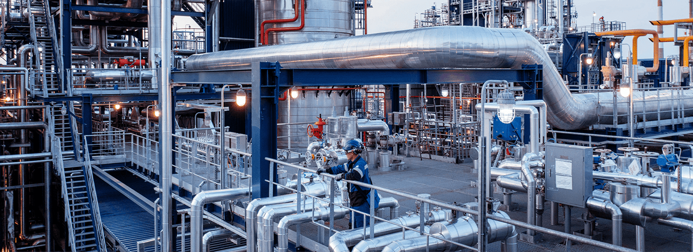
«Gazprom Neft» — one of the largest oil companies in the world — plays a leading role in the Russian oil and gas market. The company's production capacities are located in the European and central parts of Russia, Siberia and the Far East, as well as in areas with difficult environmental and infrastructure conditions, such as the Arctic zone, the Yamal-Nenetsiy and Khanty-Mansiysk districts, the shelf of the Barents Sea.
Extraction of oil and gas, production of fuels, oils and bitumen, refueling of aircraft and ships — all these are not only complicated production technologies and industrial objects, but also several hundred thousand employees and contractors. Safety, accident-free production and environmental protection are top priorities for «Gazprom Neft», as they are in line with global industrial trends and ESG standards.
The company's industrial safety strategy aims to achieve «Goal Zero»: no harm to people, the environment or property at work.
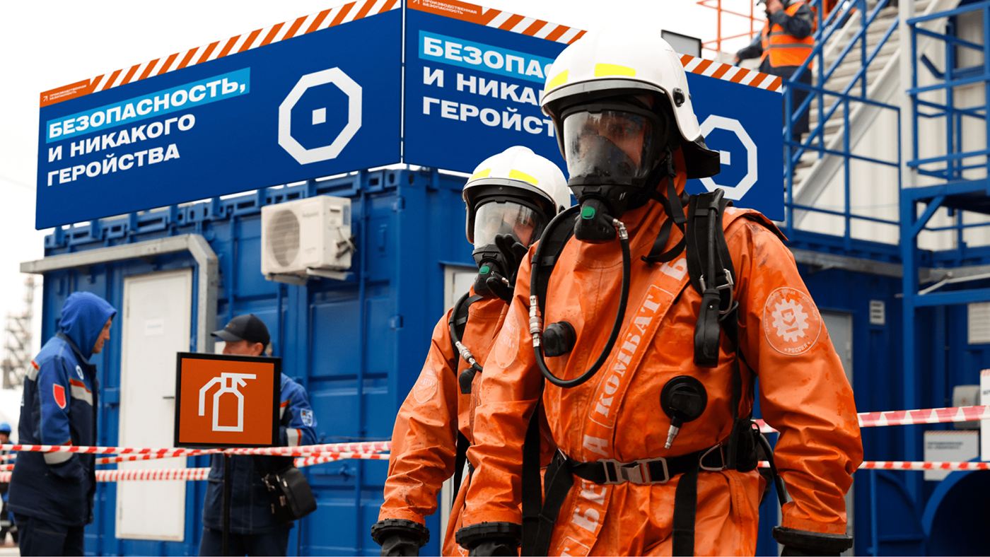
Effective communication with personnel to ensure that work is carried out safely is an important accident prevention tool. It helps minimize the risk of harm to health and nature in the production process.
We were faced with the task of developing a design system that would help the company involve its employees and contractors with different experiences and a diverse corporate culture in ensuring work safety.

General concept
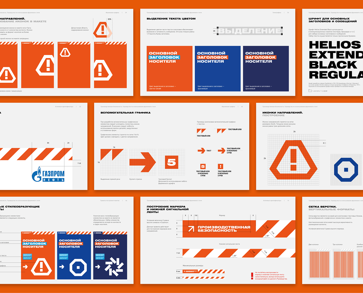
The visual identity concept was based on the idea of using GOST signal and warning elements. This technique made it possible to make corporate identity an integral part of the production process, corresponding visually and ideologically with the environment in which employees work. Minimalist forms help to convey messages concisely and unambiguously.
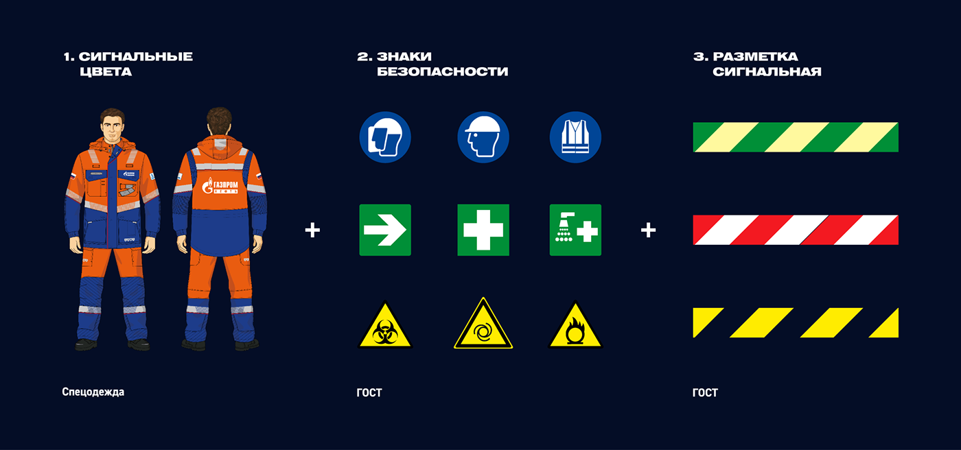
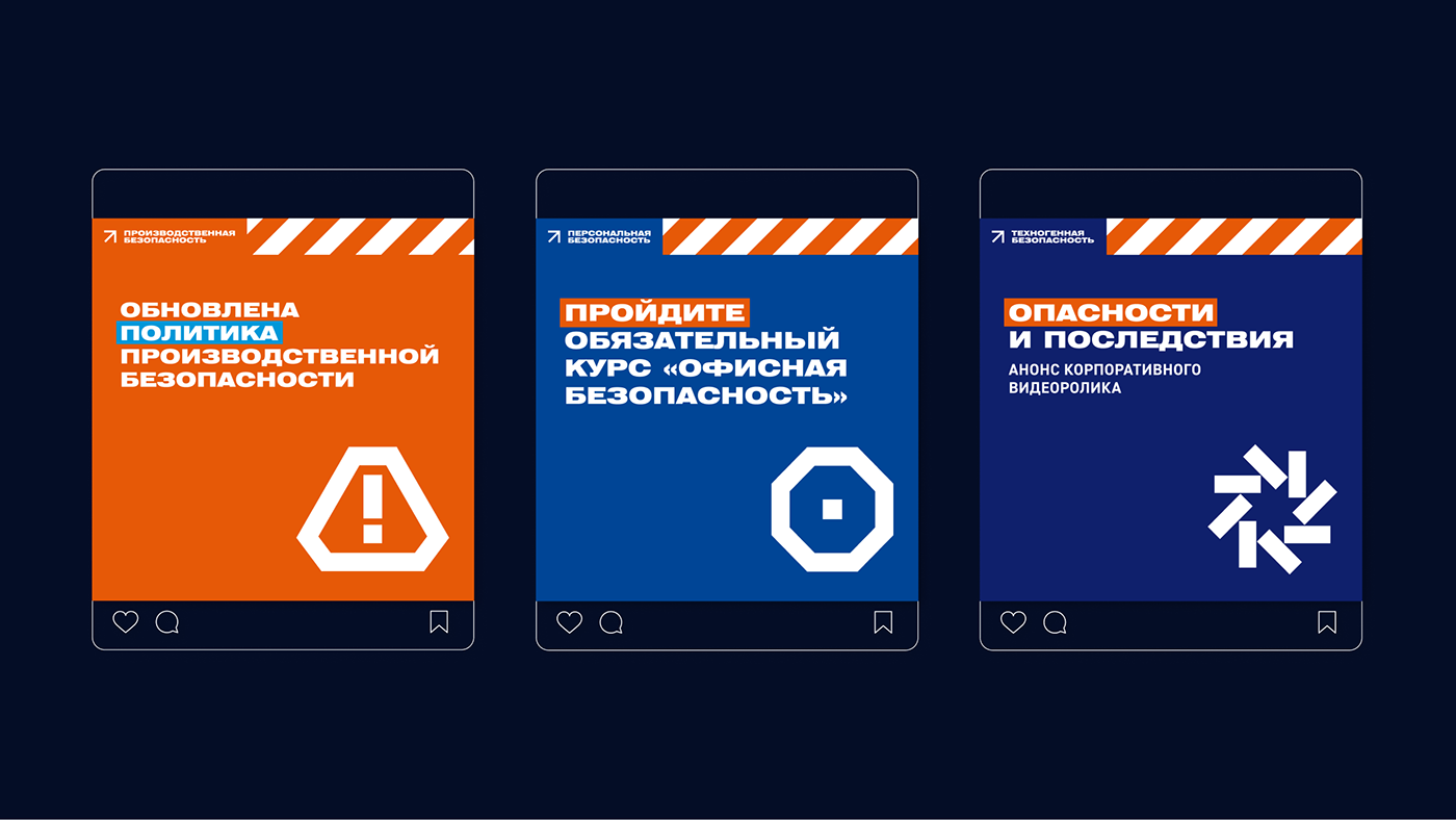
Corporate identity consists of three key elements of the OSH standards system: signal colors, markings and safety signs. These elements are familiar to employees, who know how to use them and interpret them correctly. We have taken them as a basis and adapted them to the tasks and characteristics of the industrial safety function at «Gazprom Neft».
Icons and colors
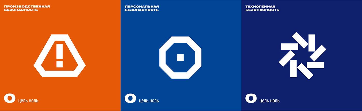
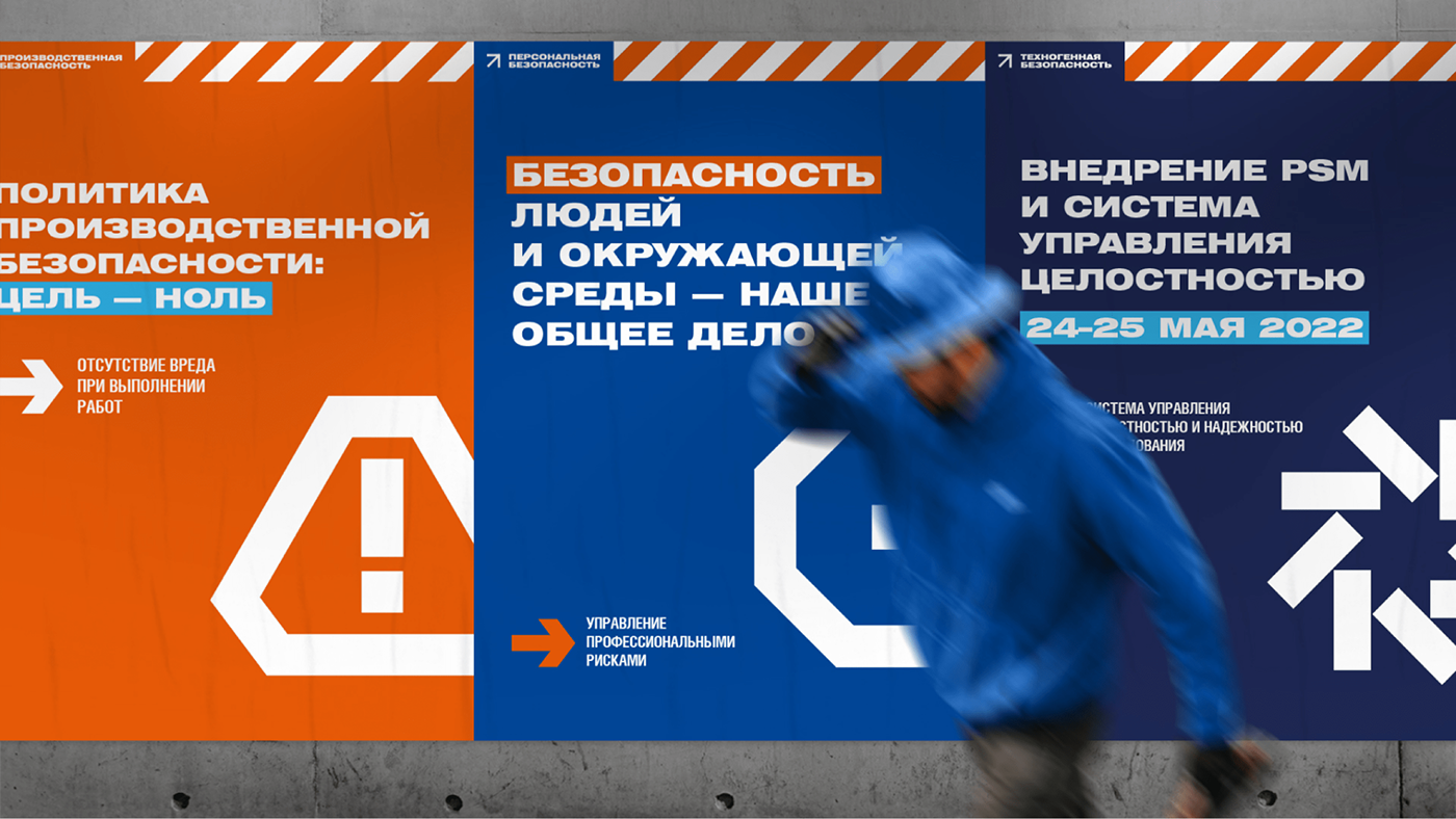
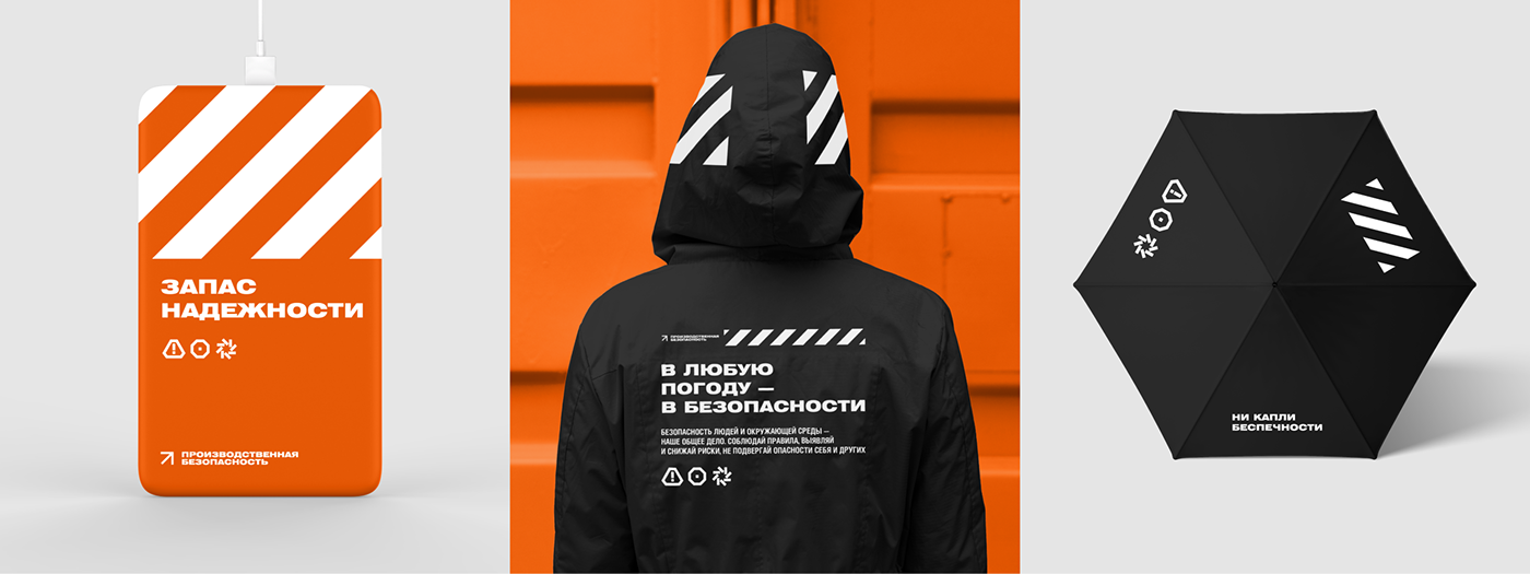
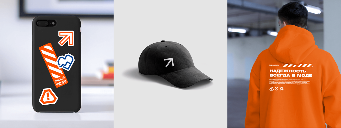
The functional directions: industrial safety, personal safety and technical safety — were divided and coded with colors and icons. Blue and orange are the main colors of the company's work clothes, which are designed to protect employees from contact with harmful substances. The closed, clear shapes of the icons visualize the idea of moving towards «Goal Zero».
Markings
The marker is the main identifier for the company's overall occupational health and safety function. In the marker, the metaphor of approaching «Goal Zero» is represented with the help of an arrow icon. The signal band serves as a unifying element for all layouts of the different directions.

Font
Another style feature is the technological and modern Helios Extended Black Font. The classic, wide pattern gives it a confident and industrial look. The plasticity combined with other brand elements keeps the style consistent while making it friendlier.
Flexible layout system
All the tools together form a flexible brand identity that allows you to create different layouts for any industrial security function.
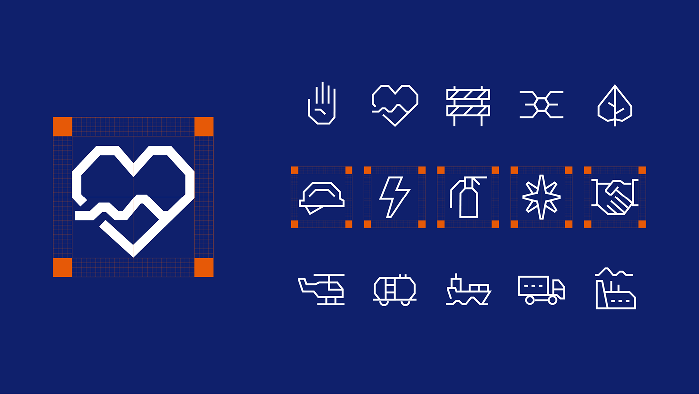
Corporate Graphics — Icons
Context icons are an additional functional style element. Their plasticity is combined with other brand elements and emphasizes a confident and reliable image.
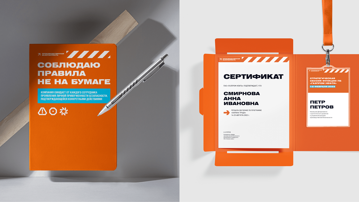
Guidelines and media
The guidelines systematized corporate identity constants, carriers and rules for building a unified visual image of the brand.